Ashley Gregersen: COMM 130: Visual Communications
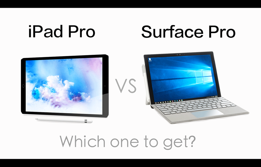
This image is from Ramrac Solutions Social Media. https://ramarcsolutions.com/ipad-pro-vs-surface-pro-5-ways-to-choose/ I will analyze the ad using a reverse engineer post. This company sells computers and tablets. I’m in the market for a professional tablet, but which one do I want?
CONTRAST
Images of the 2 devices are placed side by side. So I see that there will be comparisons. The background is plain white so I know the focus is on the devices. Contrast in the texts — dark text above the devices reminds me which is which. Lighter text below the devices reminds me of the other question: “I have to choose one.”
PROXIMITY
Images are centered in the picture with vs. in the middle. Text is centered above each device creating distinctions of what I’m looking at.
REPETITION
There isn’t really any repetition in this ad other than the use of the word Pro. Pro happens to be in both names, iPad Pro vs Surface Pro — comparing two tablets.
ALIGNMENT

Both devices appear to be evenly spaced, both about the same size. Each slightly turned in opposite directions so my eyes can easily glance between the two. The text above the pictures remind me which one I’m looking at, and the text at the bottom in light colored text reminds me of the question: “Which one to get?”
COLOR
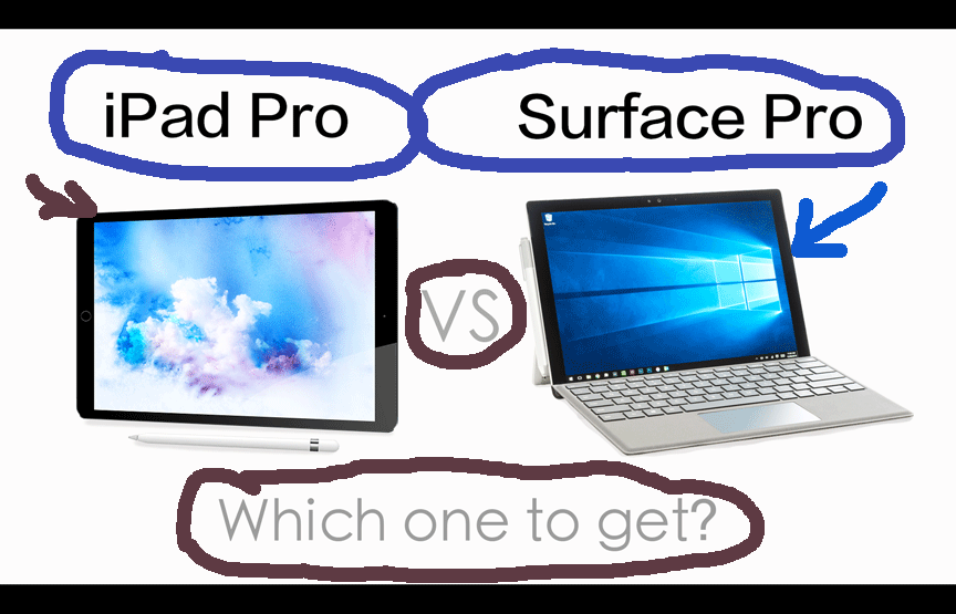
Use of color is minimal, mostly white background to make images show up better. Text is dark and light in shading, used to label and not distract from images. Blue used on device screens to show we are looking at computer tablets.
CONCLUSION
A simple visual showing the 2 options in professional computer tablets. There isn’t much room in the picture to show what each device is capable of, both look great, I want them both. If I want to know more, I have to visit the company website to get that information. If I am going to spend that much money, I do need more than an appealing picture.
