Christmas Magazine Layouts
Introduction
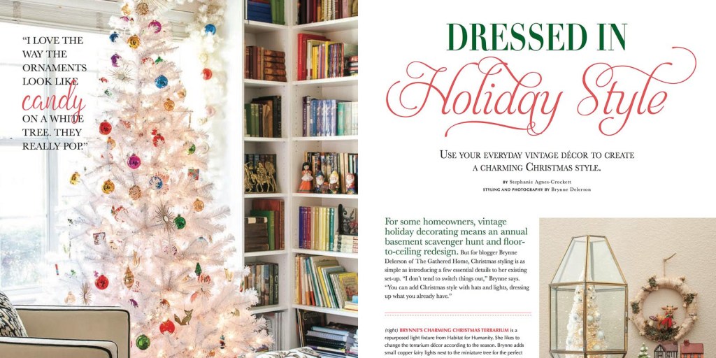
This is a blog post of a magazine spread about Christmas decorating. Christmas decorating brings the Christmas spirit into your homes. These pictures would give you ideas on how and what to decorate your homes, but there are a few things in this layout that need to be pointed out in the magazine. https://www.thegatheredhome.com/vintage-holiday-magazine-feature/
Typefaces
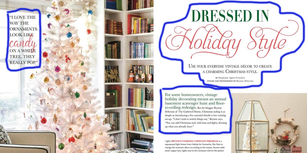
The magazine has at least two or three different type styles. There are at least a few that may have repeated itself, style-wise, but there are some differences that I have noticed when I was studying this image.
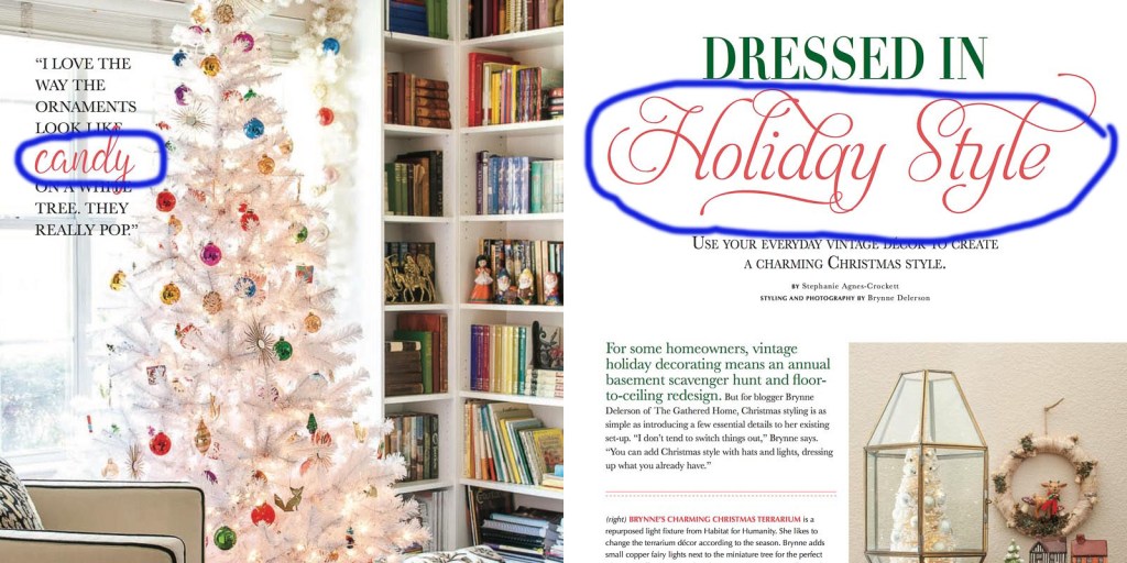
Look at these texts that are circled. They’re both the same color: red. However, they’re typefaces look different. As you can see, one of them has a more flourish decorative feel to it. The other one just looks normally decorative. More like a script type. The rest of the text around those are modern and a little bit of an old-style type.
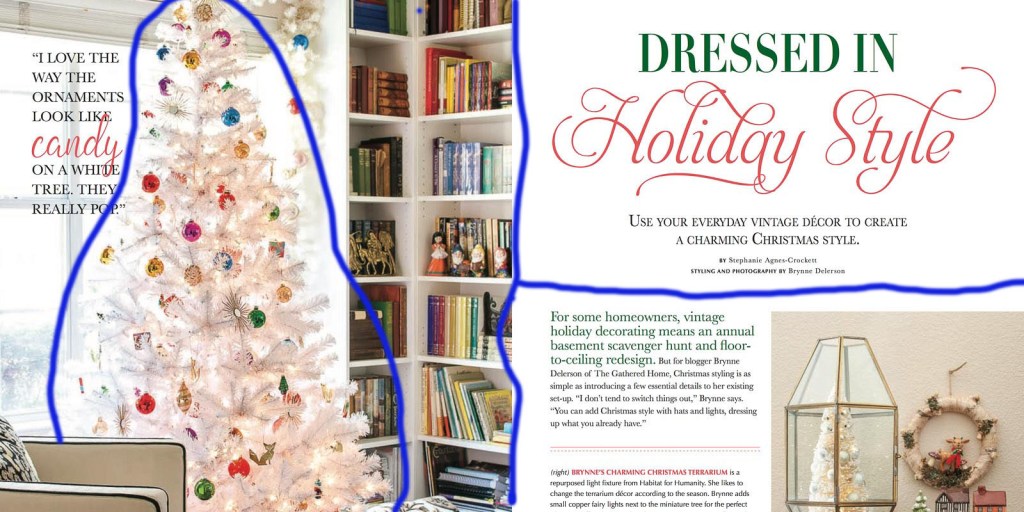
Rules of Thirds
As you can see, on the left side, the picture of the Christmas tree is taking a third of the space while the other two-thirds take up the rest, mainly the text.
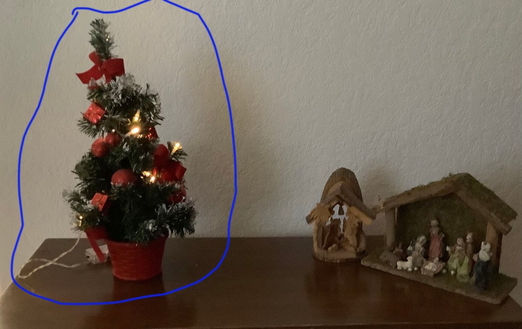

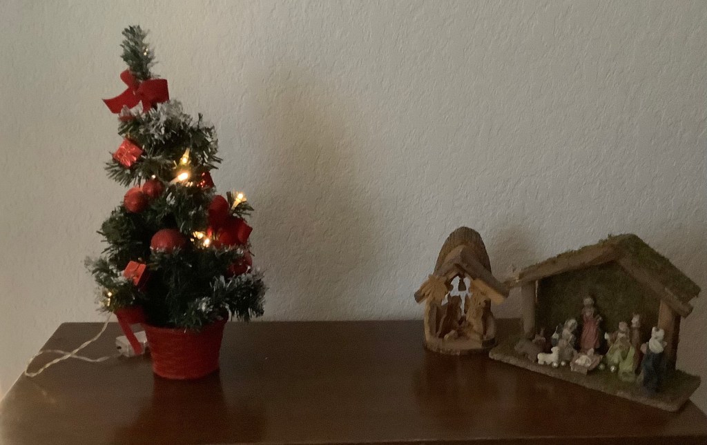
Homemade Photos
These are the pictures I have taken that go along with the pictures I have put here. These pictures go along with the magazine layout I picked out with the the tree being in the same side as it was in the magazine layout. I also drew over lines to point out my Rules of Thirds that pointed out earlier.
Conclusion
Christmas is my favorite Holiday of the year. I usually never look at magazines for decorating ideas, but I did learn on what style the typography and photography it takes to put in a magazine. Most importantly, I also learn what kind of styles each of those would bring not just to readers, but for everybody.
